

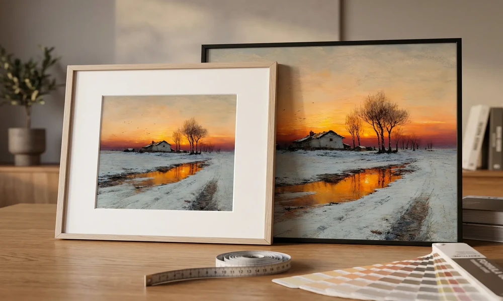
Most people walk into a frame shop with the frame already picked out in their head. They want walnut, or they want gold, or they want the thin black one they saw in a hotel lobby. Then they see the wall of samples and freeze, because none of those pre-decided frames are sitting next to a mat board yet. That’s the mistake. The frame isn’t the decision. The relationship between the mat and the frame is the decision, and everything else follows from it.
If you’ve got a print, a poster, a photo, or a piece of memorabilia sitting unframed on a shelf, this is the order to make your choices in: mat width first, frame width second, glass third, and color last. Reversing that order is how people end up with a frame that swallows the artwork it was supposed to protect. The shops that do this well, including the team at custom art framing in Austin TX, will tell you the same thing: the mat is doing more work than the frame, and most buyers never notice it.
Here’s why. A mat border creates the visual breathing room between the artwork and the frame edge. Without it, the eye jumps straight from the image to the molding, and the molding starts to compete. With it, the artwork gets a margin, and margins read as importance. That single relationship is most of what separates a piece that looks gallery-hung from one that looks like it came off a dorm room wall.
Why the mat width should never match the frame width
This is the one rule worth memorizing, and it’s the one most people break without knowing it. If your frame molding is two inches wide, don’t cut a two-inch mat border. Matching the two creates a stacked, boxy look that flattens the whole presentation.
My preference, after years of staring at framed work in both gallery settings and living rooms, is a mat border roughly 1.5 to 2 times the width of the frame. A two-inch frame gets a three to four inch mat. A skinny one-inch frame, the kind you’d buy for a small photograph, can take a much wider mat, sometimes four or five inches, and look better for it.
There’s a mouthful of a name for the balance you’re chasing here. I call it mat-to-frame ratio. It’s not a formula anyone publishes, but once you start noticing it, you’ll see it everywhere, and you’ll spot bad framing from across a room. A matched pair reads tight and defensive. A ratio reads intentional.
Two other mat details matter more than people expect:
- Bottom weighting. Cutting the bottom border slightly wider than the top and sides lifts the image visually. It’s a classic technique and it works.
- V-grooves and decorative cuts. They’re beautiful when placed with restraint, and they’re a distraction when they’re the loudest thing on the wall. Use one, not three.
If the artwork already has strong internal geometry, like a bold graphic print, skip the decorative cuts entirely. Let the image do it.
What conservation glass is actually protecting against
Glass is the part of the purchase people understand least, and it’s the part that determines whether the piece survives the next thirty years. Ultraviolet light is the main culprit. It fades inks and yellows paper, and it does it slowly enough that you won’t notice until the damage is done.
Museums and archives have treated light exposure as a preservation problem for a long time. The conservation guidance maintained by the National Archives treats controlling light exposure as a core part of protecting works on paper, which is why so much of what hangs in an archive is rotated or kept in lower light. You probably don’t want to dim your living room, so the practical answer is UV-filtering glass on anything you care about.
Here’s how I’d decide, and I’ll be blunt about it. If the piece cost under $100 and it’s replaceable, standard glass is fine. If it’s an original, a signed print, a family photograph, or anything you’d be upset to lose, pay for the UV glass. It’s not a luxury add-on. It’s the difference between the frame preserving the art and the frame just holding it.
Scenario: A client brought in a signed concert poster from the 1990s, already sun-faded on one side because it had hung near a window for a decade. New UV glass couldn’t undo that fading. What it could do was stop the other side from going the same way. That’s usually the honest conversation: glass protects the future, not the past.
Should you frame to match the room or the artwork?
Match the artwork. Always. This is the choice where I’ll take a side without hedging, because so many people get talked into the opposite.
Rooms get repainted. Furniture gets replaced. If you build a frame around your current sofa color, you’ve locked the art to a decision you’ll regret in four years. A frame chosen to serve the piece itself travels with the piece, through moves, remodels, and hand-me-down sofas.
That doesn’t mean ignore the room. It means let the room set the tone, not the color.
Warm-toned room, warm-neutral mat. Minimal space, thin profile frame. You’re matching mood, not swatches.
Color selection follows a simple logic:
- Pull the mat color from a quiet area of the image, not the loudest one.
- Let the frame pick up a darker accent already present in the artwork.
- Keep the number of distinct tones to two or three, then stop.
- When in doubt, go one shade lighter on the mat than you think you need.
The archives world thinks about this in terms of framing the document without competing with it, which is the same instinct you want here. The Library of Congress keeps a vast collection of works on paper, and the consistent theme across preservation practice is that the housing supports the object rather than announcing itself.
What custom framing costs you in time and money
Custom framing is a made-to-order purchase, which means two things: it takes longer than grabbing a ready-made frame, and it costs more. Both are worth understanding before you walk in, because they’re the reasons people either love the result or resent it.
Typical turnaround runs a week or two depending on the shop and the materials. Budget depends on size, glass type, and molding, and a large piece with UV glass and a wide mat will run significantly more than a small piece with standard glass. The honest way to approach it is to set your ceiling before you see the samples.
| Decision | Cheaper route | Upgrade worth it |
|---|---|---|
| Glass | Standard clear | UV-filtering on originals and photos |
| Mat | Single, neutral tone | Bottom-weighted cut on strong images |
| Frame width | Thin profile | Wider molding on large pieces only |
| Decorative cuts | None | One V-groove, placed off-center |
Here’s the part that saves the most money and the most regret: bring the artwork with you. Framing decisions made from a phone photo go wrong constantly, because screens lie about color and scale. Seeing the piece against real mat samples under real light is worth the trip.
A quick checklist before you commit
Run through this before you approve the order, and you’ll avoid the two most common regrets, which are a frame that’s too heavy and a mat that’s too small.
- Mat border wider than the frame, never equal to it.
- UV glass on anything sentimental or original.
- Mat color pulled from a quiet zone of the image.
- At most two or three tones total.
- Bottom border slightly wider than the top.
- Decorative cuts limited to one, if any.
- Artwork in hand, not on a screen.
Get those seven right and the piece will look deliberate on the wall for a long time. Get them wrong and you’ll be re-framing in three years, which costs more than doing it once properly.
So before you pick a frame, pick the mat. Then walk a few sample combinations over to a window and look at them in daylight instead of under the shop’s ceiling lights. I’d bet money you change your mind on at least one of your choices, and you’ll be glad you did it before the order was cut.
